It’s terrible.
Can we please just have the option to go to the old version
Utterly awful. Used to be clean, on one page and easy to see. Now have to scroll to find things. Poor work Garmin
I agree that it is terrible, I was so at home with the previous format and now am all at sea. Please can it be changed or give users the option to revert back?
You don't need to create a course to track your ride. You just need to record the ride via your watch or Edge. That is where the GPS data is coming from.
All of this has nothing to do with the Connect iOS App.
In the morning it sometimes takes a few seconds until a full sync from your device has taken place. Afterwards (usually) all data is there and statistics are updated.
LOL... love your definition "downgrade". Every single Garmin user I know (over a dozen) say the exact same thing. We all hate it. Frankly, most of us are just using strava or somthing else... or using Garmin Connect far less. They killed a good thing.
Well, the same app is actually displayed in iPhone size on a black background on an iPad, you can enlarge it, but still has no more data. It is not optimised for tablets at all. Actually I don't have an iPhone, but an Android phone, and that still has the old version in, so I mainly use that to look at the data. Rather than change the UI to a tiled interface it would have been better to develop an app for tablets and iPads. In fact I also have a link to the web page, but its now got similar constraints to the mobile (ios) app, so it is bigger, but only slightly better. (I have set it up in my iPad as a Safari link/app). My supposition is you are able to share code between the new web and mobile app saving development time, but this has resulted in a very poor user experience for many users.
I appreciate some users are only interested in a small sub set of data the watch supports, perhaps only their activity data, but I suspect a lot of users look at a mix of sports performance activities, and biometric data. It is possible in the new Connect app but only with a lot of clicking and scrolling. In the old app you could easily hide panels you were not interested in. In the new app you are forced (1) to limit the number of tiles you can see (the tiles don't carry as much info as the original display panels did), or 'see all' which requires and extra click, and also leads to a lot of scrolling. (2) Using portrait tiles is also pretty inefficient since each tile (two tiles next to each other) usually has a pi chart or something in the middle, displayed more like an icon, partly because you are packing two tiles as much info into one landscape slice. But I think adding a UI classic option would service a lot of your dissatisfied users.
For those only interested in sports performance data, I know of one who just synchs and then uses the Strava app to review his data.
You did publish a Beta, I used it briefly, but it was pretty awful, so within a few uses I went back to the classic UI. I did provide negative comments then about the Beta.
Personally I am rather happy I didn't buy a new Edge cycle computer which I was considering (I still using an old Edge pre-connect-app device), since I would have been pretty annoyed to see the connect app downgraded just after spending a lot of money to buy an Edge with connection to the app. I am pleased that I also use an Android phone so I can largely ignore the bodged UI in the new IoS app.
Finally the synching seems less reliable and slower...
Sorry guys I think you made a big mistake.
The new home page is utter RUBBISH - makes no sense to me AT ALL and I no longer have a clue what I am looking at and can't find anything I used to see at a glance and nor can I make any sense of it!!! Change it back Garmin and FIX THIS, the update is not only appalling but also useless
I suspect a lot of users look at a mix of sports performance activities, and biometric data.
In my experience, looking at the vast amount of data available often raised my screen time since I started training consistently in different activities. What I found worked for me was to keep the mobile app simple in its tiles for a quick review and continue with life, and do the deep analysis using the tablet (multitasking with other apps) and desktop in a non-daily basis.
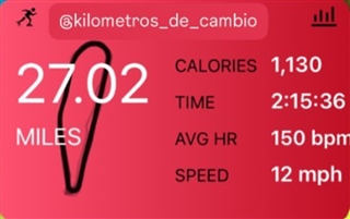
Difference between app versions when sharing activity screenshots for social media:
Notice there's no map for activities like Inline skating.

