It’s terrible.
Can we please just have the option to go to the old version
Utterly awful. Used to be clean, on one page and easy to see. Now have to scroll to find things. Poor work Garmin
I agree that it is terrible, I was so at home with the previous format and now am all at sea. Please can it be changed or give users the option to revert back?
It’s horrible and frustrating! Is there a way we can undo it and return to the old homepage which worked perfectly for my needs. I can’t even figure out how to log my weight. It doesn’t show on homepage and the edit homepage button doesn’t work. I liked the old method where everything you needed to enter by hand like blood pressure, weight, hydration and activities were all on one bar together making it very easy. I like to be able to see the basics on the homepage without tons of scrolling. I liked the sleep rings which showed very quickly the ratio of deep to light sleep. And even the old hydration graphic was a cool motivator to drink more water. Up till now Garmin has been making great improvements to its app and I love my Vivofit watch But I now detest the new homepage! Please return to the old homepage!!!
It is horrible and frustrating to use! Can we please have the option to return to the old homepage. I can’t figure out how to enter my weight because it isn’t displayed anymore and the edit homepage button doesn’t work. I prefer having all the icons for the manually entered info like weight, blood pressure, hydration and activities to be displayed altogether on one bar like before instead of having to scroll and hunt for each one individually. I preferred the sleep rings which quickly showed the ratio of heavy to light sleep and the hydration graphic which was a great motivator to drink more water. Until now Garmin has been making wonderful improvements to their app but this newest update renders it practically useless. I love my Vivofit watch but please let us return to the old homepage layout which was a joy to use!
I can’t figure out how to enter my weight because it isn’t displayed anymore
Simply configure the app. You can add the "weight" tile.
Method 1)
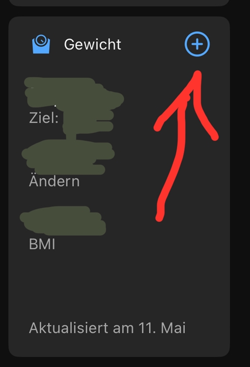
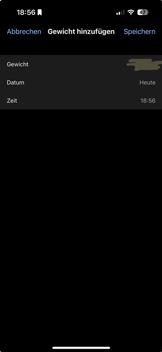
Click on the "+" in the weight tile.
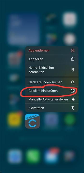
Method 2) With the app closed, press and hold the Connect app icon on the iphone homescreen. A menu then opens. There you can select "Add weight".
Method 2)
Click on the "+" in the weight tile.
Method 2) With the app closed, press and hold the Connect app icon on the iphone homescreen. A menu then opens. There you can select "Add weight".


