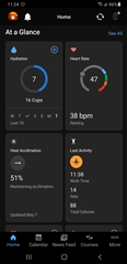
It’s terrible.
Can we please just have the option to go to the old version
Utterly awful. Used to be clean, on one page and easy to see. Now have to scroll to find things. Poor work Garmin
I agree that it is terrible, I was so at home with the previous format and now am all at sea. Please can it be changed or give users the option to revert back?
The new format is definitely not an improvement on the previous version. The hydration information doesn’t display at all and Yesterday’s data doesn’t show. The entire setup is awkward and unfriendly. Please either make improvements or allow the previous version to be used while you’re fixing the problems on current one.
The hydration information doesn’t display at all
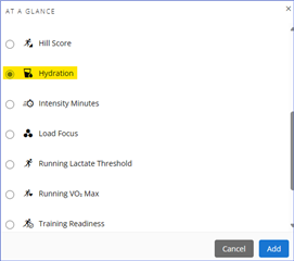
Suggest adding Hydration to the At A Glance stats. From there you can also add/remove cups by clicking the '+' icon.
new Home Screen is terrible, You took something that worked really well and forced us to use something that doesn’t work. This is form over function. A very bad example of form
Horrible! They actually paid people to change a very user friendly app to this disaster?! I switched from Fitbit to a Garmin smart watch because I got tired of the program issues Fitbit had. Maybe it’s time to take another look at someone else. Bad management decision to change.
Absolutely terrible! Who decided & got paid to create this mess & rid a very user friendly platform to follow. If we’re stuck with this program it will be time to find another smartwatch : can anyone say Apple?
The new layout of the IOS app is awful, a really backward step. Please provide the old layout. I was going to upgrade my Garmin watch soon, but I won’t if the IOS App’s layout doesn’t improve, I’ll buy the competion
I hate it. It’s hand t believe they would put something like this out