It’s terrible.
Can we please just have the option to go to the old version
Utterly awful. Used to be clean, on one page and easy to see. Now have to scroll to find things. Poor work Garmin
I agree that it is terrible, I was so at home with the previous format and now am all at sea. Please can it be changed or give users the option to revert back?
This is a terrible update, taking away of appreciated features and easy use. Simple things like adding a manual activity or wait become an effort and the homescreen is just useless-wasting place. I want the old version back. Luckely there are other options than Garmin and it has degraded itself to a data download tool only and I will go tp instead even more now. It‘s a shame how a nice app could become such a crap
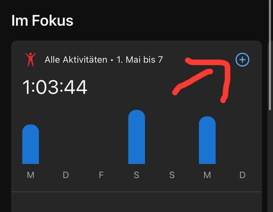
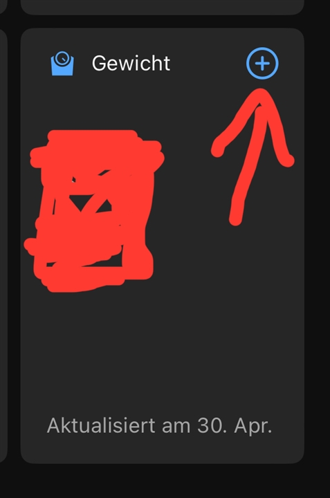
Simple things like adding a manual activity or wait become an effort
No, just tab the „+“.


Add me to the list of people who dislike this update. The old interface was so clean and easy to use. Why did you change it? It totally changed my experience for the worse. I went from being a garmin promoter to frustrated.
Please give us an option to change it back.