It’s terrible.
Can we please just have the option to go to the old version
Utterly awful. Used to be clean, on one page and easy to see. Now have to scroll to find things. Poor work Garmin
I agree that it is terrible, I was so at home with the previous format and now am all at sea. Please can it be changed or give users the option to revert back?
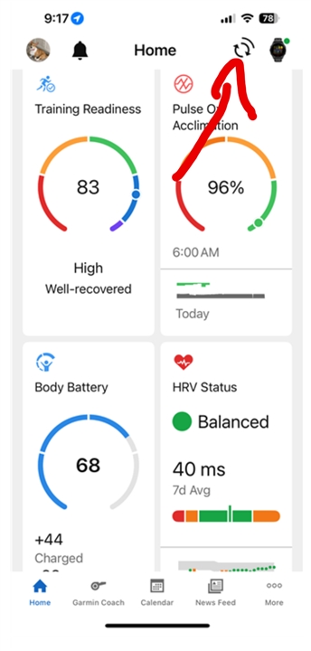
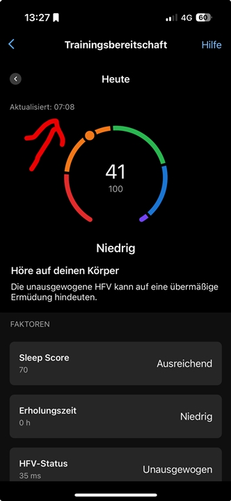
I am sorry that I cannot understand your screenshot, as you took the screenshot when the sync was not yet complete (see arrow in the screenshot).
The synchronization must be completed. Only then will the corresponding values for Sleepscore etc. be updated on the Garmin server.
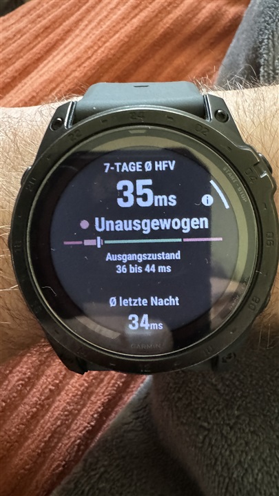
If the values for sleep score and HRV status differ between the watch and the app, I assume that the current values are not yet displayed in Connect because synchronization is not yet complete.
Could you please take screenshots again ?
It should also be noted that Garmin has clearly documented that the values on the device (the watch) are continuously updated throughout the day and can change.
These values are displayed in the overview (tile) on the App.
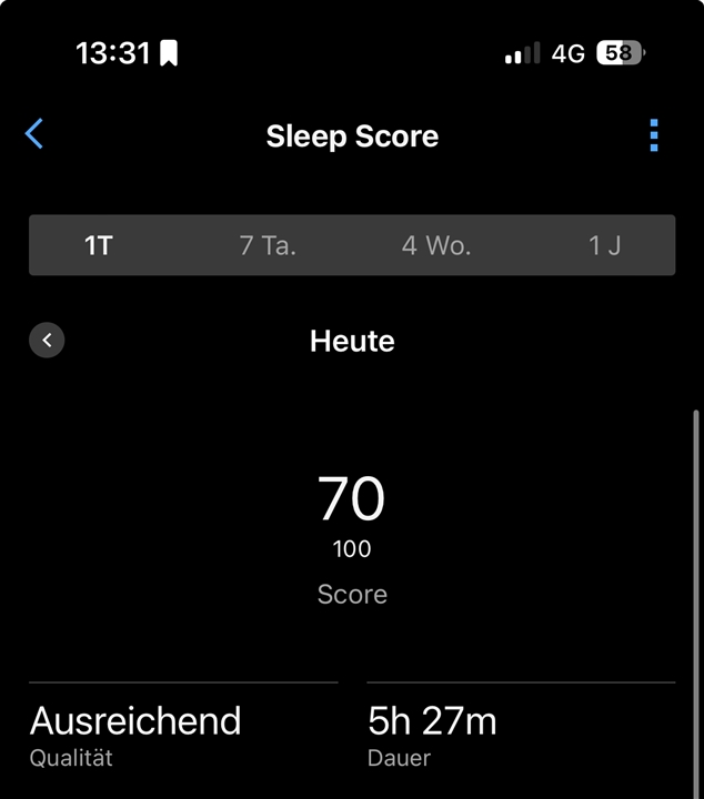
If you click on the detailed view, you will find the data that is recorded ONCE a day (in the morning) and does NOT change during the day.
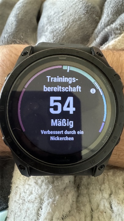
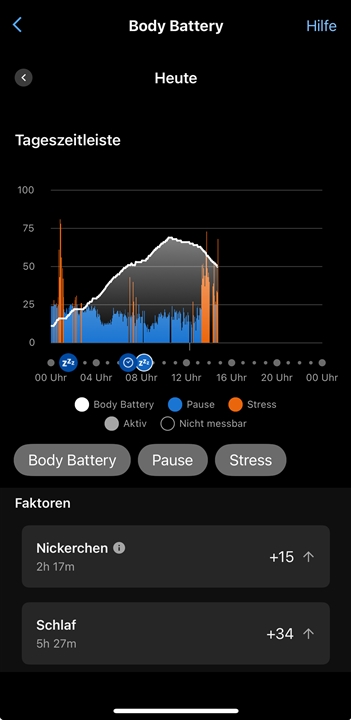
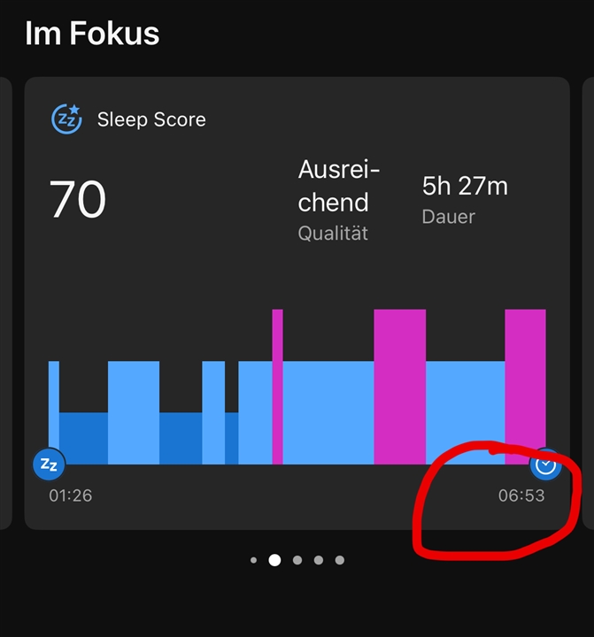
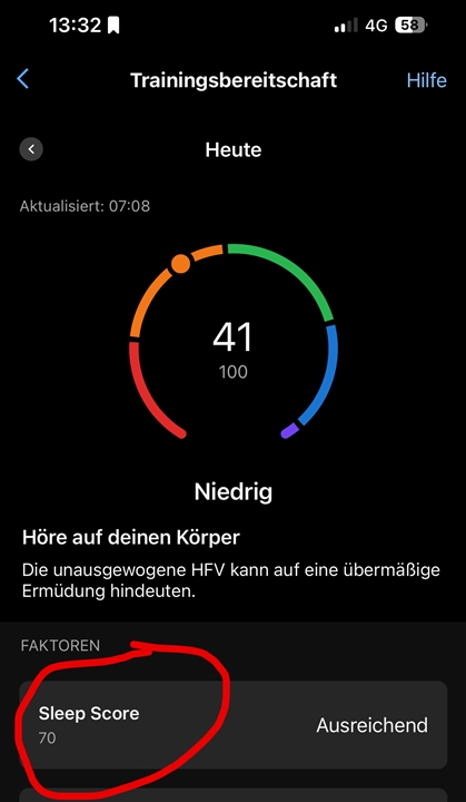
In my current example here, you can see that I woke up shortly before 07:00. At 07:08 Garmin determined my training readiness with a value of 41 (see detailed view and update time).
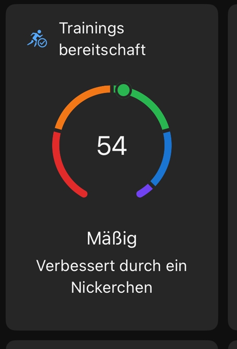
However, the tile shows a value of 54.
why ? Very simple :
The tile always shows the CURRENT value (in contrast to the detailed view which in my case was recorded at 07:08).
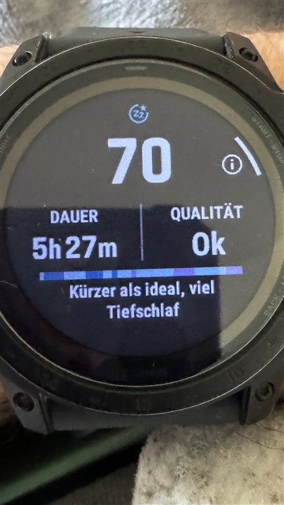
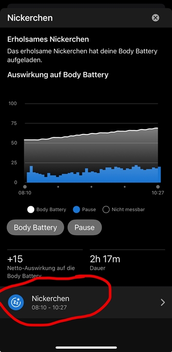
As you can see, I woke up at 06:53. Then the value for training readiness was recorded.
BUT afterwards I had a nap, which increased the training readiness (from value 41 to value 54). The current value of 54 can be seen in the overview tile.
However, the value of 41 in the detailed view is a static value for the day that does NOT change after it has been recorded in the morning.
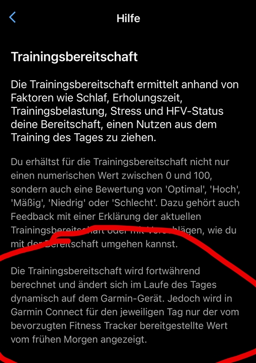
This is clearly documented in the Connect help.
..."The score displayed under the My Day card is the real time score from your watch throughout the day, and it may not match what is displayed in the report since the report shows the score after waking."...

https://support.garmin.com/en-US/?faq=WqxBu6ZwXu5eE623DNkWBA
It is therefore not wrong if the overview (tile) shows a different value than the detailed view.
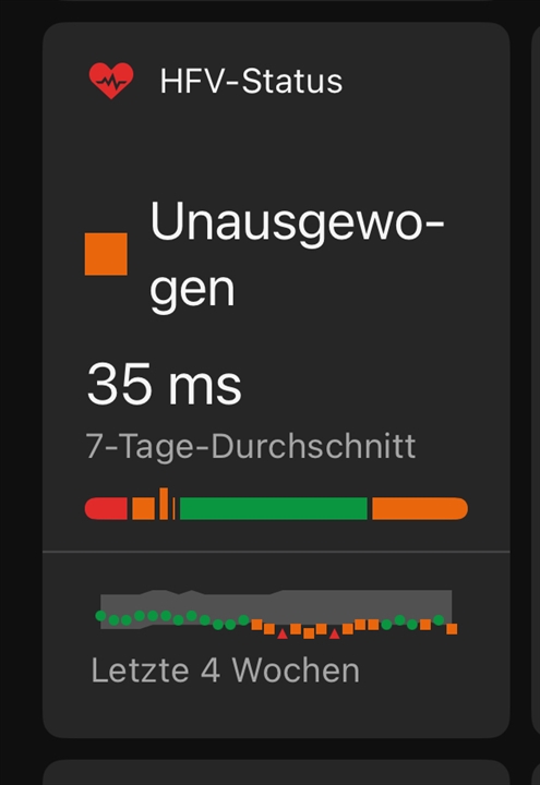
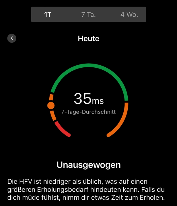
I use an iPad and an Android phone. The new home UI appeared on my iPad, and honestly it’s pretty bad. I can see 6 items on my Android, but with the new ui on iPad (which is STILL a scaled iPhone app) I can now only see 4. Lots of space wasted with the new tiled ui, which is actually less useful to me. Love Garmin devices, but not sure how long I stand this new disaster. I looked at the preview and gave bad feedback on it, but you don’t seem to have listened. Tile uis are really not suited to mobile devices, and your isn’t very good in its web version either. Please have a word with your UI designers, and in the meantime restore the old UI.
Agreed. There are much cheaper and more feature laden sports watches out now that put my Vivoactive 3 Music to shame. Now that the Connect App has been broken ( with no apparent path to the previous version) , I'll be looking elsewhere for an interface. It's blantaly obvious Garmin IT didn't Beta test this 5.0 version as by judging by the already 3 pages of negative comments in 6 days, it has already gone down in flames! FWIW, I have the Android version 5.0 , but posted in this IOS thread mainly because I found it easily and don't want to waste anymore of my time looking for the specific thread to vent in. ;)
I’ve tried to find the new version front page to be as useful as the old one but cannot. It is clunky and takes up too much space. What I could see on one screen before I now have to scroll and also there are data that are no longer shown. This is a really big downgrade. I think I need a different company’s watch if this is what we are stuck with.