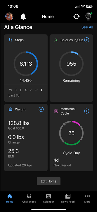
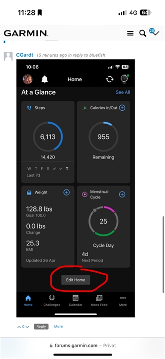
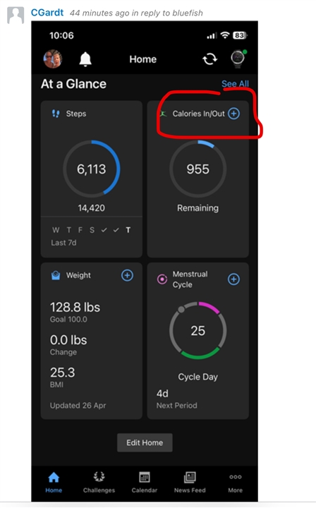
It’s terrible.
Can we please just have the option to go to the old version
Utterly awful. Used to be clean, on one page and easy to see. Now have to scroll to find things. Poor work Garmin
I agree that it is terrible, I was so at home with the previous format and now am all at sea. Please can it be changed or give users the option to revert back?
I agree, after using the Garmin app for many years & daily without fail. Until a couple of weeks ago when I crashed bike & fractured pelvis. Lost step record of 1428 days, though now looking at the new screen not that worried as time for a change. The new screen is useless. Always did want a Tag Connect, so time to sell the Fenix 7 it seems.
Absolute trash. Why does Garnin think we need such a huge box with a ton of empty space in it? Then clicking one of those “cards” shows the same exact thing, with even MORE empty space. I just bought this watch several months ago after being a long time Fitbit user. Sorry I wasted my money on it now but I’ll be looking for a different brand at this point .
previously I could see all the data on the main page and I track my calories / food
Could you show a screenshot how the screen looks like when you tap the tile?
Está horrível, Além de perder o funcionalidades e ficar com visual confuso há diversos erros de integração e pede dados
Same here; disappointed and super frustrating!!