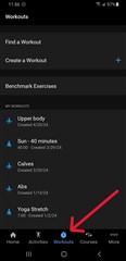
It’s terrible.
Can we please just have the option to go to the old version
Utterly awful. Used to be clean, on one page and easy to see. Now have to scroll to find things. Poor work Garmin
I agree that it is terrible, I was so at home with the previous format and now am all at sea. Please can it be changed or give users the option to revert back?
I can’t add workouts like I used to
7181032, how were you adding workouts before? Do you mean create a workout? If you have the workouts tab, it's easy to get right to it. Same as before.

I used the beta for about 5 minutes and switched back to original. Somehow Garmin fell for the sunk cost fallacy, since they likely paid programmers to improve something that needn’t improving, and thus felt compelled to switch without option to keep the original (or it would have been glaringly obvious someone screwed up. Ugh….