Sign-in and vote to see the poll's results.
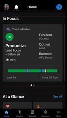
This screen is awful! I need my dashboard back!
Awful new screen. How do I go back to the old one??
They will never admit their mistake. Too pig headed! This is awful, I've discussed with 2 kids, their spouses and 3 friends and every one of us hates it. Just texted my younger daughter to hold off buying…
Sadly I agree with you... but the reasoning is poor. What about the lost revenue and thus jobs due to customer dis-satisfaction? I'll switch when my watch needs replacement. I've told my youngest to look elsewhere even though 2 of her siblings have Garmins now. All 7 people I recomended Garmin too are unhappy with this platform. We will all be gone in the future; and I've been a "Garmin" guy for well over a decade. If they won't listen, why should we the customers care?
They will definitely stick with it.
It's sad because it's hard to believe a company of such global reach is unaware of how out of brand this is and how it affects those who use it daily. As said before, for a company that invites people to get moving and beat yesterday, an app that increases screen time and drowns one in data as if using the desktop is ilogical. Maybe there are people who spend more time looking at data than there is those that don't. Does the app work? Yes. But is the layout functional and appropriate to the majority of the audience it caters?
In my opinion from a graphic design standpoint the design could've been better thought out and revised with the feedback provided. And this trend of excessive scrolling and hiding data at a glance has been present since 4.70 (example here). Back then no adjustments were made either. I don't know the details, but I'd say it was designed in-house. I don't mean to undervalue the team's ability (if it was indeed done by them), though I'd argue that a project that encompasses all the community (not just one model or market) would've benefit from being outsourced or done in collaboration with a top-tier agency specialized in the matter—not only in the technical aspect but also the user experience side of design. It would've surely have received better rating than what's been given to date. I mean the ads released so far about it are far better than the app itself to say the least. To add some feedback given in the beta, is it really necessary to have a title with such emphasis given? And why add the spaces like it was layed out in a word processor with double-enter or 'space after paragraph' given? Simple stuff that could've received second thought before releasing it to the public.

If they won't listen, why should we the customers care?
Regardless, since being active on this forum I've experienced that some part of Garmin does listen to feedback—it might take a while though. Both that and the watch's design not being affected by this new update (Yet! ) is what makes me not seek other sports watches. I'll rely more on Strava, Training Peaks and Final Surge than Connect Web, that's for sure, and won't upgrade my phone for as long as it continues to work on the previous version.
Who knows? Maybe they'll actually pay attention to the feedback they're soliciting and will address the common denominator in them we're reading about everywhere.
Maybe this is what Garmin wants but last night in a group ride 6 of the group have already switched to a competitors bike computer. Once Garmin looses a customer base they will not come back easily. Maybe Garmin cares less about people that actually use and and only care about the wellness side of it with the dumbed down interface which is to small with the squares as compared to the older layout with rectangles and less data.
Then the sync on the web page to replicate what is on the app is a joke as they have 2 different purposes when the old web page layout was really useful.
Yeah, designing for two very different focus (sports and wellness) is very hard. If the introduction to the update when it asked for focus instead of suggesting tiles it would've display the new layout or previous one (with the chance to change the layout in settings) I think it would've had a better result.