This discussion has been locked.
You can no longer post new replies to this discussion. If you have a question you can start a new discussion

Color blind / Sleep chart colors

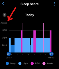
I’m color blind and have a hard time reading my sleep pattern chart with the purples and pinks and such. You all need to create a color blind setting with higher contrast. Even my Wordle game has this feature now. I saw others bring this subject up in this q&a / complaints section years ago. Looks like our recommendation (10% of you male users, btw) was never looked at

  • The bars representing individual types of sleep stages have each different height, hence the graph is very well readable even for 100% color-blind people

  • You have to know what the colors of the bars at different heights represent. I have colorblindness, and my experience is that it is difficult to read. 

  • You have to know what the colors of the bars at different heights represent. I have colorblindness, and my experience is that it is difficult to read. 

    If you see gray on black, you can see the stages labels on the left side of the chart (tap on the sleep pane to open the full screen mode)

    And in fact, it is very easy to remember, once you see it: the Deep stage are the deepest (lowest) bars, and the Awake periods are the tallest bars. You can't mistake, once you understand the logic.