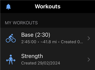
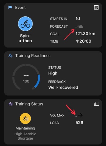
In addition to the widely reported VO2 Max font size, the same bug occurs with the days temperature in the Events tile.
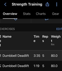
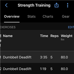
In ‘Strength Activities’ the column heading ‘Weight’ splits over two lines. Both on my iPhone 15 Plus, App Version 4.76.0.23.
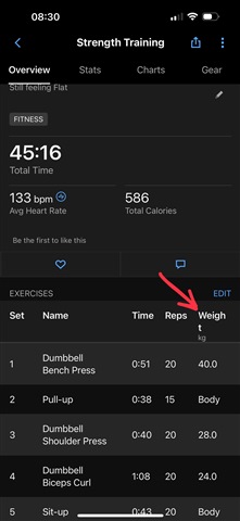
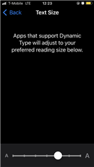
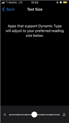
I run with the font set to 110% because of the large contrast in the Font Sizes Garmin uses throughout the app. The font size will correct itself on my IPhone, but not my iPad Pro, if I set it to the default 100%, but then some of the font is minute ie Notes, Activity dates & details. Reported all issues to Garmin Support over a month ago and was told to keep font size at 100%!! Thats the Fix!!
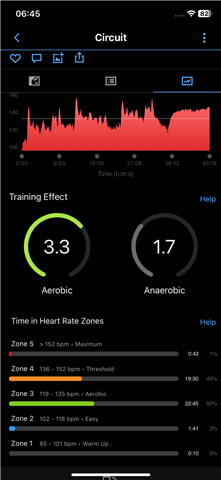
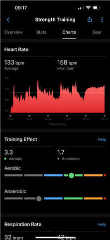
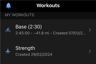
I have an old iPhone 6s with App Version 4.71, smaller screen & running at 110% font size and its has none of these issues. The layout was so much better, better use of graphics. With the latest version there is so much dead screen space as can be seen by comparing the Strength Activity screenshots.
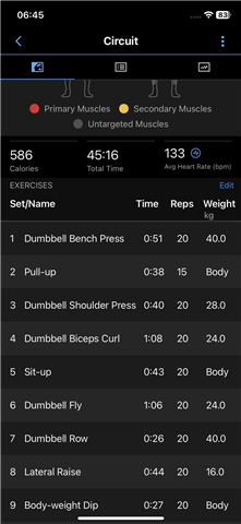
I wish I could go back to the previous version of the app, with the circles. It was so much better & clearer in comparison to what we have now in my opinion, My Epix Pro 51mm is a great piece of kit but is now massively let down by the state of the app.
