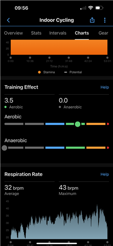
Having updated to Connect 4.73.0.21 I’ve noticed the Training Effect Chart has changed again for walking, running & cycling activities. The training effect number is now at the top of the section and not sat on the graph line.
Personally I don’t like the new format with the line graph, and this latest update has made it worse.
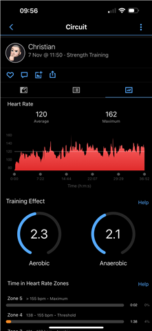
The original gauge type graph, which is still present in strength training activities was loads better, I did prefer it when all the colours were round the ring, like in the line graph but as it is, it’s still presents the data in a better and lot clearer, uncluttered format.
At least it would be better if we had the training effect data presented in a uniformed manner across all activities? I find myself keep having to look at the help screen for an explanation on the format.
Some things just work and don’t need to be changed (for the worse)
Anybody else think the same?