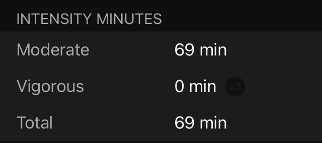
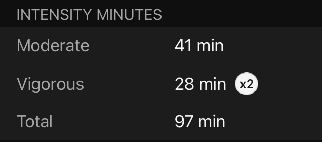
Thanks trux! I never realized it functioned like that. From a design standpoint, just having a dark grey inside a black area is a poor decision. I also would've never associated having a black Vigorous x2 icon in this context as being turned off. Maybe a darker gray (same as letters for repetition) or no icon at all would’ve been a better option, in my opinion. Maybe it’s my OCD with these kind of details…