This discussion has been locked.
You can no longer post new replies to this discussion. If you have a question you can start a new discussion

v4.70 App Changes

Can we just go back to the old interface? It wasn’t broken and I feel like it was better streamlined than it is now. Why is there such a larger emphasis on the route map? Why are my my shoe miles broken into a new tab now? This redesign is awful. 

Sincerely, 

a designer

  • I have the same problem. Adding gear after a run on the mobile app is a nightmare now. It used to be so easy. Complete mess!!

  • How to add gear to mobile app hasn’t changed. You still just select the three dots top right of screen like previously.

  • It HAS changed. When you click the dots you go to a list of gear which asks you to ADD gear ie another pair of shoes. Previously you could select some gear that was already added. When you eventually find the screen (never sure how I eventually get to it) the descriptions are now compressed to one Line so I can’t even select the right pair of shoes where I have more than one of the same brand - previously there were two lines so I could select my blue Hokas or my black Hokas. It is unusable at the moment! 

  • I’m using the latest version of IOS Connect app. I’m just checking you’re using the Connect IOS App and not Android. I’ve included a screenshot from my Run this morning from the IOS App.

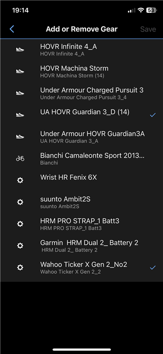
    After selecting 3 Dots at top right of the screen for my Run in Connect, I get an option to ‘Add/Remove Gear’. I select that and get this screen.

    I added my shoes and HRM (ticked). I just checked that I can add other items and I could. 

    I note your comment about seeing one line about your gear. As you can see in picture I get two lines. I can still EDIT the gear descriptions in GEAR section in Connect (…More at bottom right of My Day screen).

    I’ve got the Connect Web version loaded in Safari on my IPhone.  I do the gear selection, enter activity description in the web and export the gpx on my phone then manually import gox to another app (it doesn’t connect to Garmin). The view if the GEAR in the WEB version is ok.

    can you post a picture of your screen(s) when you’re adding gear

  • Thanks for the response. If you are adding new gear this is the screen that you get. However, if you want to tag a pair of shoes that you just ran in this is what I get. First screen  shows after clicking the "three dots"the second appears when clicking "add gear." As you can see the descriptions are single line. You will see that I have for example three "NB Fresh Foam 1080" and I cant differentiate them unless I can see the second line. Maybe I just have too many pairs of shoes! However, I have two locations where these shoes are kept so that I don't have to carry shoes when travelling between the two places.

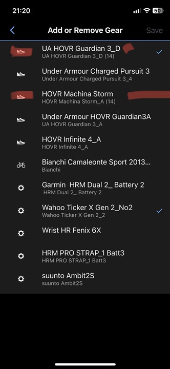
  • I just went into the Gear menu (…More ) and edited the names of the shoes with red edit mark in picture.

    I edited first line of name of top pair of shoes. 
    I can see your issue with unable to see 2 lines (possibly IPhone model but mine is ok on IPhone X (IPhone 8 vintage). I use _A, _B etc to differentiate same models and I suggest you edit your brand details to something like my example for UA HOVR Guardian 3_D to simplify ID of correct shoe post activity and add full details in ‘nickname’ area of Gear

  • Ryan, of course I can go an edit my descriptions and put A, B etc. but then I would need to keep a seperate list of what A and B mean e.g. A are the blue version and B are the Red - seems rather pointless having any description in the App if this is what it comes down to. My point is that this change makes the app so much less easy to use. As another example I now have some shoes added to a run (see screenshot) where I had to guess which pair it was. Unfortunately I guessed wrong - I chose the blue pair instead of the red pair of the NB Heirro shoes as I couldn't see the full description on the screen (see second screenshot) - and so now I have the wrong pair of shoes recorded for that run. I am now trying to work out how to change them and mark the right pair. However, I can't find out how to do this so it appears that once you select a pair of shoes you are then stuck with that selection forever. The app used to be so easy to use and it is now a complete nightmare!! I fail to understand how anybody could think that the changes to this aspect of the app could in any way be an improvement. If you only have one or two pairs of she's then I guess this doesnt make much difference but I have a lot of shoes that I am tracking - sets in two locations, trail shoes, road shoes, treadmill shoes, etc., etc.


  • hello, I installed version 4.7.1 of Garmin connect, on an iPhone 6s+, and unfortunately I still have a problem when I want to display the graphs: they do not appear well. When I want to scroll down, they disappear. I am attaching a video capture of what is happening. These display problems appeared with version 4.7 of Connect.

    iPhone 6s+
    iOS 15.7.8
    Thank you for your help.

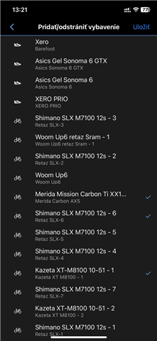
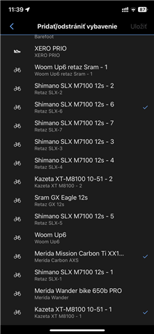
  • Please look to attached pictures. After each activity I have there mixed gears. It will be nice to have there functionality to organize all gears. Not necessarily to have shoes for ride as they are allocated for run. 

  • I posted on this forum a day or two after the update and having tried to use (and enjoy) this new version my conclusion is that it is more than a disaster. It is not eye-friendly, not screen-friendly nor user friendly. It is as if Garmin asked programmers who last programmed in 2006, before the iPhone was launched, to prepare the update. It is without doubt the worst "new version" of any app I have on my iPhone. Luckily I have 2 phones and have NOT upgraded on my second phone.

    It goes against the concept of easily visible info "one screen", intuitively locatable info by moving back and forth between related screens. However more than this, this new version has 100% put the block on me sending info to my mates and they to me. It is as if Garmin have deliberately wanted to stop the feeling of community.

    I have worked as a consultant and mentor to tech startups and based on the app format now would not be able to recommend going to investors

    Let's see what Garmin do. Or are they too arrogantly American?