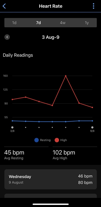
I would value having two separate axis for resting and high HR values so the relevant axis can be compressed for each value group.
This is because the high values stretch the axis upon which the resting values sit as per the chart, so one can’t see variations particularly well (one can hover over individual values, but to see a trend is not as clear as it could be).
We know changes in resting HR by a couple of beats can be indicators of illness or fatigue etc so would be good to see trends more clearly - corroborate HRV trends as confirmations as well.
Even just a toggle to turn off the high HR value would be useful - if the axis re-scaled on this toggling - but a second axis would surely be much easier - surely very easy? - and more useful.
Thanks