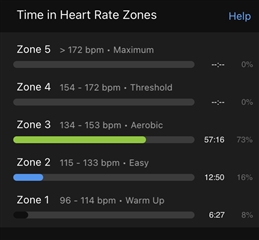
Besides the Extra Large My Day and Yesterday Activities appearing in Connect, I noticed the change of color for Zone 1. I'd like to point out that adding black lacks contrast and it should be considered going back to light gray color for easy visualization.
Below are examples of the color now and how it used to be.


Second screenshot originally posted by 5802977.
Support the request of an inline skating app here.

