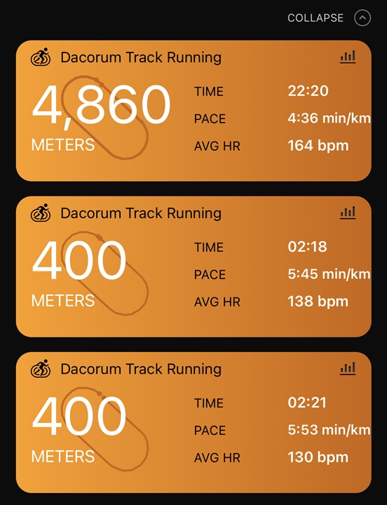
What have you done to the alignment of the pace?!
What do you consider to be wrong? The pace is aligned with the values for time and average hr. The text is a bit too far to the right. Some padding is needed to make it look better.
Yeah what you said. It’s just gone like this since yesterdays update!!