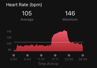
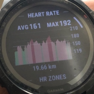
Maybe a toggle option to see this in landscape mode. I think it would be easier to identify zones this way also when comparing with other graphs.
If anyone agrees please suggest it here:
Different examples of how it is in Connect and on watch:


Support the development of an inline skating app here.
