I just updated to the most recent version of Garmin Connect 4.41 and I noticed that the intensity minutes weekly graph is no longer available. It only shows my daily figure and no more weekly progress. Is this fixable?
HI all! I understand the frustration this has caused, I am sorry. I have gone through and have added every one of you to our customer experience case. I have included all of this feedback as well!
Hello all, this thread has been mixed with other issues not pertaining to the original post. An update was released. The changes are only to the app feature being redesigned. This did not affect how the intensity…
Hi all! Thank you for your patience. Could you please update your Garmin App, there has been an update and some redesigning.
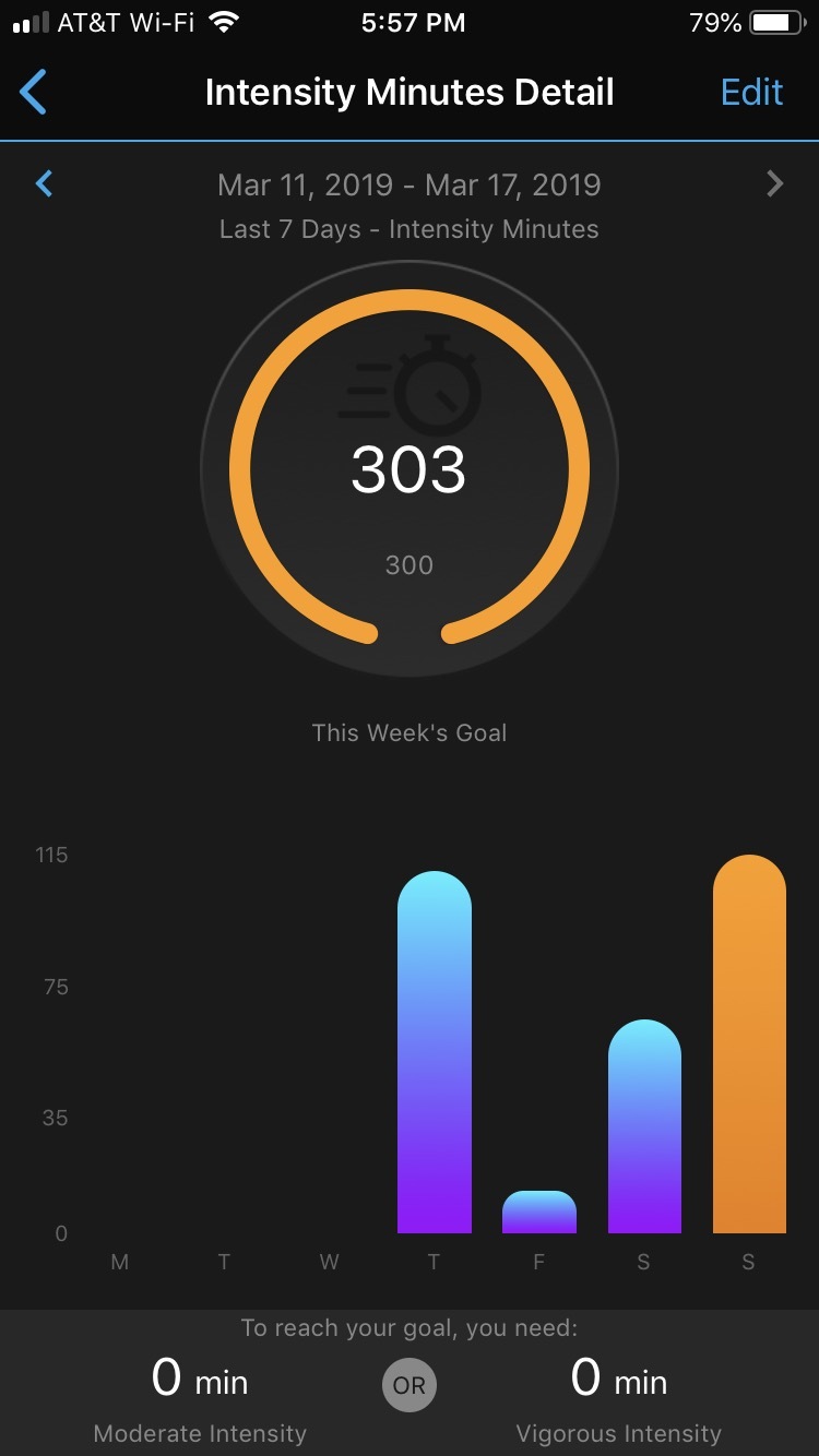
I prefer the original way I think we are all used to as it posts both weekly and daily progress instantly. The current instant access is useless. Thanks!
having the same issue. Really unhelpful change since you set your goal weekly . Any other way to see the weekly progress?
Please add me to the users list who
want the old format. Thank you
PLEASE bring that view back! Make it an option to choose between this graphic view and current view.
If this will not come back consider me and all my friend on whom behalfe I write: GRAMIN will never again be our choice when byuing next sport watch. I will inform all my other friends you are a company that IGNORES its community.
ANYONE who agrees with me please give me a VOTE.
So, what makes you not buy a Garmin watch is that you don't see a bar chart for intensity minutes? The graph that we have today shows the exact same data but in a line graph. With the new graph it is easier to see how far you are from reaching the goal.
For me it was more competitive. To see bars from one day to another. I enjoyed keeping tract of that. Now with single line graph there is no day to day competition. It easy to make option in app: 1) show bar graph ora 2) show line graph.
If it is so easy, why not give choice.
You can still easily compare the day to day values by scrolling down. The days are listed with there values.
Send your suggestion to Garmin: https://www.garmin.com/forms/ideas/
I would also like to add my name to the request to bring back the old intensity minutes format. I’m no longer even able to get to the old format by going through the three month graph. In fact, I actually no longer have a three month graph, just one day, one week, four weeks, and one year.