This discussion has been locked.
You can no longer post new replies to this discussion. If you have a question you can start a new discussion

Wrongly designed entry fields in iOS App

Dear Garmin-Developers,

please test your apps thoroughly before realising them!

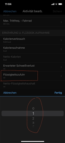
In the "Edit Activity"-Screen there are still a number of wrongly designed entry fields e.g. the drink volume is not designed as numerical entry (text-)field, but as dropdown-selection in ml-steps, which is complete non-sense (do you believe that anyone will scroll from 0 to lets say 1.500 if you had two bottles during a ride?).

This is not only poor usability, this is just a design-mistake and should have been resolved long time ago if anyone had thoroughly tested the app...

There are a number other fields that have the same issue.

Please get this corrected soon!

  • That's interesting because on my android phone under edit activity here is no section for "Nutrition & Hydration." However, on my iPhone there is. As you noted, you need to scroll down in 1 ml increments to add hydration during the activity. When entering hydration for the day you have the option to add in 50, 500, or 750 ml increments or use the +/- to add in 250 ml increments. So at least on that data field there was some thought to making this easier for the user.

    Developers aren't responding to forum requests, but you can get a case submitted which will be assigned to them if you contact Garmin directly using the Garmin Support Center.