You can no longer post new replies to this discussion. If you have a question you can start a new discussion
The pace graph on connect is a series of spikes and not a graph of pace?
Former Member
See the pic here, this is also the view of the pace on the web version. The strava version looks fine so I think the data is OK but the visualisation is wrong.
Have you resolved this? I'm getting this resulting graph on two different garmin watches now. The first few activities are fine...and then this happens.
Have you resolved this? I'm getting this resulting graph on two different garmin watches now. The first few activities are fine...and then this happens.

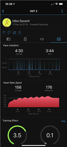 See the pic here, this is also the view of the pace on the web version. The strava version looks fine so I think the data is OK but the visualisation is wrong.
