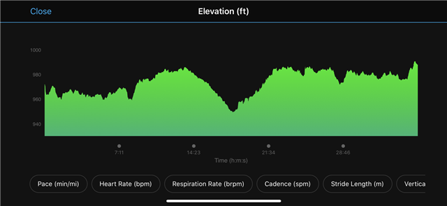
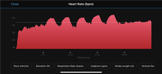
If you look at the attached charts, you'll see that approximately 50% of the vertical axis is wasted space. The data should use most if not all of the vertical real estate.
Specifically, for my heart rate chart, the lower bound on the y axis should be 120 or higher. For the elevation chart, it should be ~949 to ~995 (as narrow as possible).