
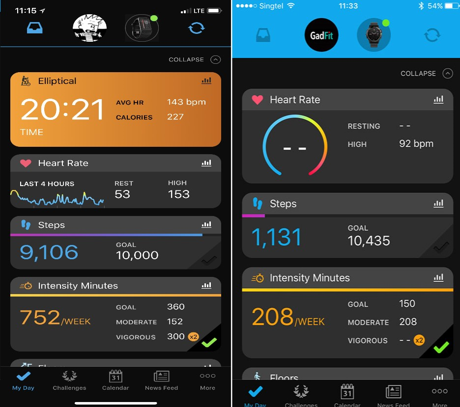
When I look at Garmin Connect iOS the heart rate widget on My Date shows a graph of the last 4 hours, plus my Resting and High Heart Rate numbers (left image). However I see many people who are posting screen shots of Garmin Connect iOS and the heart rate widget on My Date shows a circle, plus the Resting and High Heart Rate numbers (right image).
My query then is what determines which version you see? I cannot find any settings that toggle the view to be different and therefore I am assuming it is based on the watch you have? I have a VivoActive HR.
thanks
ciq.forums.garmin.com/.../1314474.png


