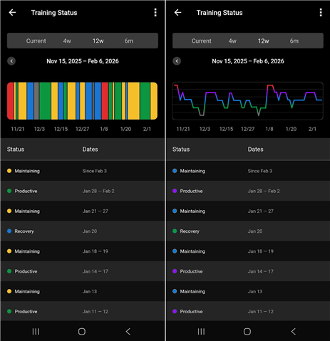
I’ve been struggling with how Training Status is visualized in Garmin Connect, especially the color choices and the striped history bar. The current palette, gray → blue → yellow → green → red, doesn’t follow an intuitive spectrum. Yellow reads as a caution or warning, yet it represents Maintaining. The color bar also compresses status changes into thin slices that are hard to read. This creates a disconnect and forces extra interpretation every time the chart is viewed.
A more intuitive spectrum might flow like this: Detraining (gray) → Recovery (green) → Maintaining (blue) → Productive (purple) → Overreaching (red). This provides a natural gradation, reinforcing the idea of moving along a continuum, and aligns better with how people perceive progression and load. Recovery should feel positive, Maintaining should feel stable, Productive should feel like energized progress, Detraining and Overreaching should stand out clearly as a limit.
The line-graph mockup shows how much cleaner this data visualization can be. The line’s position communicates exertion load, while the color gradient communicates quality, making trends easier to follow and reducing visual noise.
This small redesign would make Training Status easier to understand at a glance and more motivating overall.
Left - current visualization; Right - improvement