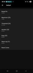
Since Garmin Connect was redesigned, the HR Zone Setup UI seems worse and really basic. The previous design of the HR Zone UI page that showed the BPM ranges for each zone was so much better. What was the reasoning behind this change?
It seems painful to take a step backwards. Surely it's beneficial to be able to see these BPM ranges when setting up HR zones?