Hi,
Garmin Connect on Android seems to have recently added a possibility to show pace graph over distance on x axis.
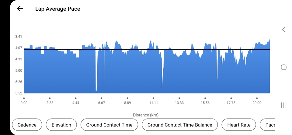
I have noticed that it is incorrectly shows the lap average pace graph then. It is totally correct when plotted over time axis.
What is wrong? It is OK for the first few kilometres (about 5 in my case), but then it just shows the (immediate) pace and not lap average pace.
Also, there are too many laps on this graph in these five kilometres, there should be just 5.
Screenshot over distance:

Best,
M.

