This discussion has been locked.
You can no longer post new replies to this discussion. If you have a question you can start a new discussion

New Garmin connect mobile updated home page is awful

I cannot believe how bad the new Garmin connect home page is. Why remove the ease of viewing my day with one glance of the app?. Now have to scroll through the page to see all the info that was contained in my day section.  On top of that, the user has no ability to bring back the old display or edit it to something similar. This new update is so annoying I suspect my next smart watch won't be a Garmin.

If this home page stays as is, I will no longer be a Garmin user for ANY of their products.

Update to moderator.   Nothing in my original post was "uncivil".  Why do you keep censoring my comments?  

Ray

  • Agree.  I can't add fields to the yesterday amd last 7 days summary.  I used to get all kinds of information about my last week.  Average sleep,   calories,  steps,  total miles,  etc.  Now it's gone! 

    I can see it now in garmin headquarters........

    Let's see.  What do it users want?   Oh,  I know!  Less information!  Let's give them less info.   They will love it! 

  • Yes the new homepage sucks, please bring earlier format back. Can't imagine sticking around with Garmin with this rubbish.

  • I agree, the new hope page does not provide the data I have come to rely on in a convenient format. "Fixing" something that isn't broken, just for the sake of doing something new is not progress. If some users prefer the new format, great, let them use it, but at least provide a way for those of us who like the old format to continue using it. Companies who unilaterally make these types changes without regard for customer's preferences are strongly communicating how little regard they have for those customers. 

  • Maybe if enough users complain they will go back. If you can do the following:

    1. Rate it 1 star in the play store or the app store

    2. Contact garmin using the website: https://www.garmin.com/en-US/forms/ideas/ or by emailing their support

    3. Tag them on twitter.

    The play store app rating went down from 4.5 to 4.4 already and there is a flood of 1 star reviews there, it will likely keep dropping until they address problems.

  • It already dropped to 4.3 I'm hoping it'll drop substantially for them to notice their mistake. Just left my 1 star review. 

  • They obviously don't care about us. I also rated one star on Google Play.

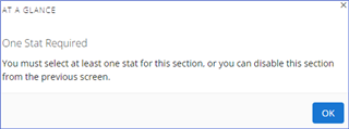
  • I just got it. At a glance is ridiculous! I accidentally put in blood pressure as the first one and now i can’t get rid of it since it is the first one and it says I’ll lose the at a glance whatever that means. I have to go to see all and my steps and sleep are buried . What a mess. Agree that this could turn me off if Garmin. How can I get rid of blood pressure! I thought I was deleting it first thing. 

  • you can add more tiles, remove tiles, reorder the tiles and turn on or off the whole at a glance thing in the homepage setting. You can add a few you would like to see and then remove blood pressure.

  • i can’t get rid of it since it is the first one

    Add a different stat, then you should be able to remove blood pressure.