
Hi all,
Not sure if its just me, but for as long as I've noticed (at least a year), the Weight chart on the Garmin Connect Android app show's little grey range boxes that are wrong. The top and bottom are always around 0.5kg too high / too low respectively. That is, the chart does not match the data. I don't have iOS to compare too, but the same "boxes" are correct on the Garmin Connect website.
Here's an example screenshot from the current Android app:

If you look, for example, at the right-most day "12/1" (ie 12th of Jan), the max for the day was 77.0 KG, but you can see the grey box goes well about the 77 KG line (~0.5 KG above). The bottom is also well below the 76 KG point (ie half-way between 75 and 77), despite the minimum being 76.1 KG that day. Every single day has the same issue.
Now if we compare the the same period on the web:
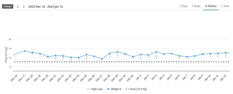
You can see how on that same day (Jan 12) the light-blue "High-Low" indicator is entirely below the weigh-in - indeed, it's shows the correct 76.1 ~ 77.0 KG.
So, in summary, the web is right (matches the data). The Android app is wrong (for me), and has been ever since I took the time to notice. Is it just me, or is the Android app's chart wrong for everyone? Does the iOS app get it right?
Thanks!
PS I've recently joined the Garmin Connect Beta, and it has made no difference - still as broken as it was before.
