This discussion has been locked.
You can no longer post new replies to this discussion. If you have a question you can start a new discussion

About the new Beta Interface...

I have been using the new Beta UI for a bit now, and I must say, I hate it.

Here are my thoughts, and I am wondering if others feel the same or differently.

1. In Focus: I don't see the point of this. It basically shows a taller slideshow container with a maximum of 5 items. I don't see any additional information than wat was available on the tiles before, but now the information for 4 out of the 5 items is hidden, requiring me to scroll to see it. Why hide the same data that was available at a glance before, and make me scroll to see it?

2. At a Glance: This is now limited to 8 items. It requires me to click on See All to see the rest of my data. Why?

It makes no sense, since if I didn't want to see an item before, I could just uncheck it and hide it.

The vertical tiles are fine, but the rest feels more like someone new came in and wants to change things, for the sake of change. But it is not a good change, and it will impact my decision to stick with Garmin in the future.

Having said all that about the poor usability, I should complement the design itself, which is a nice refresh.

  • It is a shame, they have amazing products, but this UI is garbage.
    Sadly im on iOS, so i need to find someone with the old .ipa file to roll back. Apple doenst make the process very easy..

  • You can opt out of beta Connect in settings - Beta Program - toggle off.

  • I did that. But my phone updated the app this morning to v5. It is now no longer beta, it is the app UI.
    Trying to find a previous .ipa file to roll the software back.

  • And what about the people who participated in beta and after a month didn't like it. Any way to opt out like in The beta?  The best part I found of the beta was opting out and going back to the original

  • I'm afraid not. Mine has just this moment changed. Beta is now the finished product and the only choice we have. I really don't like it. Either the majority of feedback was positive or Garmin don't care and are just doing what they want.

  • Dumbing down is a pretty dumb idea. But what is really dumb is needlessly limiting the number of visible activities. The mixing of side scroll and vertical scroll is just as dumb too. It's as if they hired someone straight out of school who has no clue about UX. I've been thinking about abandoning Garmin for a while now, since Apple, Pixel and Samsung are getting close to my battery life needs, and the accuracy of their sensors and algorithms appear to be surpassing that of Garmin. This is kind of the last straw and when I replace my Epix it will probably be with a different brand. The fact that nobody from Garmin even chimed in to address the comments here, or the Beta feedback, is salt on the wound. Anyone remember Blackberry?

  • Yeah I really hate this new layout on the connect app and it's frustrating to see that it's now been pushed out at the new normal..I liked the old screen and had no problems with it. This new one is much slower to see everything I want.

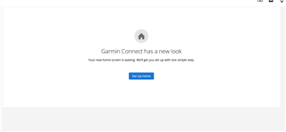
  • Yeah, this morning I went on the web app and got this page

    And after having had a page of useful information that was displayed as I wanted I've now got this, which is of no use whatsoever