This discussion has been locked.
You can no longer post new replies to this discussion. If you have a question you can start a new discussion

New format beta

Please, please do not do this.

I've had it for at least several days now and it is the most annoying thing.  The layout of the standard garmin home screen was fine ... don't fix what's not broken.  

I was hoping there might be additional training insight, but there is no new information; instead, all the information is harder to locate, and requires an excess of side swiping and searching through to see what was a very efficient, simple, easy to read layout before.  I was just going to turn off the beta but I'm afraid this will be coming out as the standard format soon and feel compelled to voice my very strong objections. 

If you're going to change anything make it easier to see more training insight.  The garmin watch is supposed to be able to sense what swim strokes youre doing, but it gives no information on that for my swim workouts (because i switch between several strokes through my swims, and it seems that information should be viewable if it is advertised that the watch model does this).

Or another improvement I would really appreciate is being able to sync my garmin watch to Zwift for when I'm doing bike trainer rides, because it definitely does not show accurate heart rate while I'm on the bike trainer, and i have to have another brand chest strap hr monitor to incorporate heart rate data for my rides in watopia.

But the garmin app homescreen was something which I had never even considered as needing improvement, and now that the beta has made me think about it, I really appreciate the old home screen much more.  Please don't change it, or at least don't do anything as drastic and cumbersome as the beta layout.

  • +1000.

    Some companies listen to their customers. Some other don't. Time will tell...

  • Not sure I understand your concern. It's a beta program. The point is to directly listen to the customers, to get their opinions and concerns well before it goes to production. The current beta version is a long way from being a finished product. 

  • One very big positive change imo is that the Home screen in the app now is synced with the new Home screen on Garmin Connect Web. Changes you do in one place will sync to the other. That means that it will be easy for you to move between different platforms and still have a consistent user interface. 

    This could be a step forward making the different platforms more consistent with other functions as well. The apps are missing a lot from the web. I always use the web interface since it is so much better and got all functions.

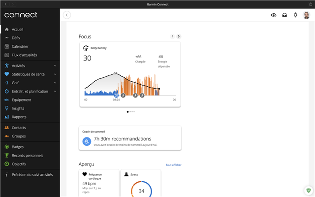
  • Yea well for me that's more a feature removal, not having a Desktop version and a mobile version anymore. I think it is obvious I won't use the same setup on my 40" screen as on my small phone screen. Already portraint vs landscape rotation is an obvious difference, let alone size and resolution. The screenshots I have seen waste so much space on the Desktop and force unnecessary scrolling.

    Sure it's fine when using multiple or new phones. But leave the Desktop view out of it.

    I was hoping for new features and fixes:

    Thoughts on the Mobile App:

    1) Make the Activity List populate itself by pinning the users most actually used Activity Types. Currently you pinned a lot of activities regardless if the users has ever done any of them and therefore wasting space.

    2) Add a word filter to search for activities.

    3) Allow more overlays for the track graphs for example sup (no speed overlay), or basically allow it for any activity with a recorded track.

    4) Users should be able to select if they want a speed or pace graph (again SUP only supports pace, no speed on mobile app, both are available in the web interface)

    5) Do a different evaluation if an activity is recorded as an indoor variant (GPS off), currently you still try to evaluate speed, distance, moving time based on GPS that of course all shows 0 as GPS was not used, better: if GPS is off in the activity, give us other stats, instead of showing us all those empty GPS based data-fields, like heartrate, movement time based on intervals (active / pause), steps per interval

    6) Bring back the lap view for "other" and fix that that first interval is falsely labeled as "pause"

    7) Allow track trimming in the mobile app (don't repeat that annoying bug the web interface has where it zooms out to show the whole track once you move the slider to adjust a little bit at the end, making it impossible to see what you are doing)

    8) Add some more cool Instagramable templates to share activities with friends, those work as advertisement for Garmin too.

    Overall Web App:

    1) Allow default gear to be setup for every activity- and subtype. Maybe even allow photos of the gear. And more gear statistics, not everything is measured with GPS, sometimes usage time could be valuable (overall time, active time, pause time for example climbing shoes).

    2) Give us evaluation tools for strength training progress like: strengthlevel.com/

  • I hadn't thought of this. I've never used the web based interface. 

  • I'm sorry... Come on Garmin...

    Truncated text, empty space everywhere...

  • I agree.  The new format is not helpful.  I would like to return to the previous format.  How may we cancel the Beta test?

  • I agree.  The new format is not helpful.  I would like to return to the previous format.

  • I've seen also that for some "widgets" in the new version (eg. : HRV status), there is a little graph under the widget showing the values for the last 4 weeks / last week. That can be very helpful for example, for sleep score, or stress (7 days avg)...