Please bring back the 3 circle preformance stats. I loved the former dashboard
Please bring back the 3 circle preformance stats. I loved the former dashboard
Update as of September 2023:
Feedback is currently being reviewed regarding the recent changes made to Garmin Connect 4.70 for further consideration.
Thank you,
This is just horrible design change. I have no notifications so promoting the bell icon on prime spot in the app is just absurd.
I share your opinion. This new version is not at all ergonomic.
Garmin Connect updated today to V4.7 and run activities are no longer providing total ascent in the overview tab or in the newsfeed. You have to go through the stats tab of each activity to find it. Why…
I doubt they will bring this back, they are just dragging their feet. It's a horrible decision, the circles were iconic, like McD Golden Arches, instantly recognizable. Why they would decide to do away with this makes no sense.
Also, adding gear to your run after you are done is glitchy too, unless you get it just in the right sequence, it won't register/update.
I recently updated Garmin Connect on my tablet only to find that the hamburger menu (top left) was gone and replaced with a shortcut icon to the inbox (which is surely one of the least useful features in the app). The menu itself is completely missing and was replaced with an Apple-style "More..." button in the bottom right.
What do we need to do to get the menu back? Switching a control of the most basic kind for something in exactly the opposite position on the screen is both gratuitous and disrespectful of your users, Garmin. Please provide a way to restore the old functionality and work the way apps are intended on the Android platform.
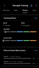
Latest update has got rid of the last of the ‘Circles’ that displayed ‘Training Effect’ data from Strength activities.
The new bar graphs with the numbers at the top are terrible! A step backwards in my opinion. The ‘Circles’ were Clear and Concise with the larger number surrounded by a circular bar graph.
Please can we have them back?? or the option to have them?? They match the new home screen a lot more than the latest iteration.
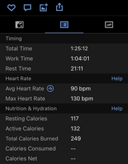
From recent updates I've learned to first update my iPad and then my phone. I can still share how it looked before this update.
What previous design did right:

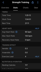
It's worth mentioning the new design did improve things as well. Like the Stats section with its type hierarchy, and readability with spacing added. This space elongates the length of the section which makes for more scrolling, but it's appropriate and functional—not like the cover photo in Overview which covers more area and as a result important data gets pushed down.
It also added Training Effect in there that for some reason I never noticed it wasn't before. Kudos Garmin!


Hesitant about upgrading to the new look the app will take. Hopefully good feedback is given in time and taken into consideration.