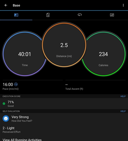
Please bring back the 3 circle preformance stats. I loved the former dashboard
Please bring back the 3 circle preformance stats. I loved the former dashboard
Update as of September 2023:
Feedback is currently being reviewed regarding the recent changes made to Garmin Connect 4.70 for further consideration.
Thank you,
This is just horrible design change. I have no notifications so promoting the bell icon on prime spot in the app is just absurd.
I share your opinion. This new version is not at all ergonomic.
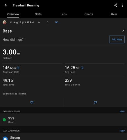
Garmin Connect updated today to V4.7 and run activities are no longer providing total ascent in the overview tab or in the newsfeed. You have to go through the stats tab of each activity to find it. Why…