
Hello Garmin!
When looking at the historical heart rate data, the Resting Heart Rate (RHR) values are usually dwarfed by the max. HR values (see below). This makes it quite hard to get an accurate sense of your RHR trend, it mostly looks like a flat line..
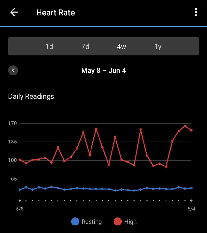
- Is there an option to view this better?
- Could we work on a quick fix for this? (curve toggle, one y-axis for each, separate plots, separate tab for RHR...etc)
Thank you!
