This discussion has been locked.
You can no longer post new replies to this discussion. If you have a question you can start a new discussion

Connect App Pace v Speed

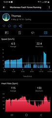
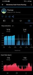
As you can see from the graphs, having PACE as the only option for Running means a lot of the detail is lost.

I switched to the running data to Ccycling so you can see the SPEED (first image).

Having SPEED is clearly more informative graphically, showing the detail and variation better than with PACE.

Can you please give us a SPEED option for running?

  • They are identical except for the scale. The only real difference is that speed goes down to zero so you can see when you are almost not moving. Pace will go towards infinity when you are standing still.

    To view details you can click the graph, turn the phone side ways and use your fingers to zoom and pan.

  • Spot on, i want to open the app and have a meaningful scale that doesn't approach infinity and that doesn't flatten the change in pace/speed. My coach can see easily a drop from 22 to 18kph in one graph above, but the other looks roughly like 3'/km, the 20% difference is barely noticeable.

  • Zooming doesn't help. The line in the example stays relatively flat and there is no granularity in the y axis figures. You'd still see a relatively flat line opposite 3'/km, not a 20% drop of from start to finish (of the race block at the end).