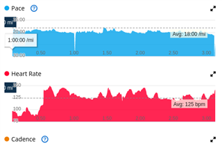
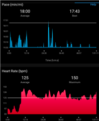
When I edit the distance on a non-gps walking activity, the pace chart becomes hard to look at on the Garmin Connect Mobile (Android) app. It looks more sensible on the connect.garmin.com website. The pedometer underestimated my distance, so I edited the activity from 3.06 to 3.40 miles.
I think it may just be poorly choosing the Y axis range. Before I edited, the chart in the mobile app looked much more like the one on the watch and the one on the website, only the actual pace figures were lower due to it being based on the wrong distance.
Here are screenshots of the web version and the Android version after the distance has been edited.