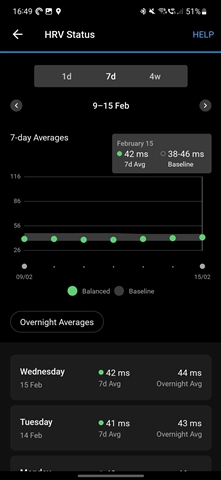
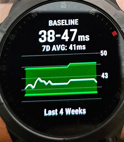
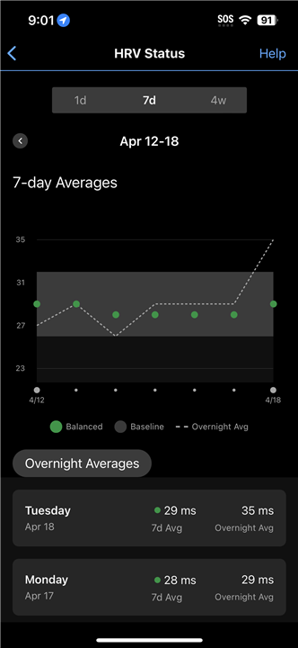
For the HRV status graph, the y-axis is too zoomed out to be able to see changes in the 7d Avg against the baseline. Difficult to tell what the max value on the y-axis is linked to however in the two 7d ranges shown below the 7d Avg and baseline ranges are similar. The main difference I can see is the second 7d period has a day with a much higher recorded 5-Min average. I think this has only recently changed and was much more readable in prior versions.