This discussion has been locked.
You can no longer post new replies to this discussion. If you have a question you can start a new discussion

HRV stress graph lacks color coding

When I take the HRV stress test with the watch and the HR strap it shows the score on a nice color-coded wheel: green, yellow, orange, red. Why is the graph just blue bars? It would be great to have the same color coding thresholds for the graphs on mobile and web.

  • It would be great to have the same color coding thresholds for the graphs on mobile and web.
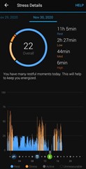
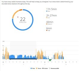
    But both sides do already use the same color coding for the HRV Stress - different shades of orange for the stress, and blue for the rest:


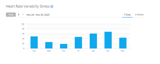
  • I am looking for a zoomed out version of this where I can look at a week or a month. Every morning I do the HRV stress test using my HRM-Tri and it is supposed to be better than the all day stress from the watch (i wear my watch fairly loose). It takes 3 min and then it gives me a reading with a color. I can see those readings in a graph "heart rate variability stress" but the bars are blue:


    I guess i would also settle for a color-coded weekly and monthly graph of "stress" but I cant seem to get that either (just a line plot)