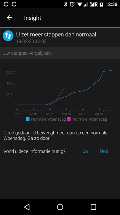
The legend of the plot does not seem correct, since both color indicate the same (see attachment). Or do I read the plot incorrectly?

The legend of the plot does not seem correct, since both color indicate the same (see attachment). Or do I read the plot incorrectly?

Could you try switching your Garmin Connect Mobile language to English in the User Settings, to see whether it is just a translation glitch, or whether the labels are identical in the original English version too? I tried on my GC, but did not find this graph anywhere in my Insights.