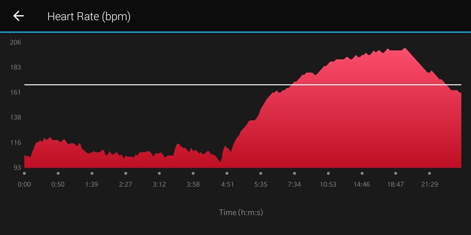
In a 25 minutes workout, for example, the first half of the graph shows the first five minutes of the workout in great detail and the second half of the graph compresses the remaining 20 mins. Was there a reason for this? Can we change this to a linear representation of time?