
Pulse Ox charts used to show on a scale from start to finish, 4 hour timeline, on their own. Now they are embedded within a full night chart and are showing very squeezed, smaller, even the lines on the graph are missing segments which was never the case until this update.
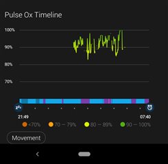
Can you please bring the previous view back or make a new dedicated view that shows the data with more clarity? It was much easier to read until v4.20. Thanks!