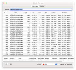
I just started noticing an odd behavior when dbl-clicking a track name in a list to get its info window to come up. The summary line at the bottom - Points, Distance, Area, etc - is not tall enough to display the information. Or, it often will come up entirely or partially hidden and needs some careful scrolling to get it to display in its entirety.
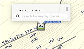
Also, single-clicking a waypoint pops up a box where the name is mostly obscured by the 'Search for nearby places..' dialog. Again, one can scroll a bit to see the entire name, but not ideal.
In both cases, no amount of window re-sizing fixes this quirk.
Anyone else notice this? Any solutions?
I'm using macOS Big Sur v 11.1 and BaseCamp v 4.8.11


