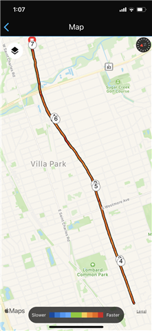
On the Garmin Connect map for an activity, the route is shown in a color scale which supposedly shows when your pace is faster or slower. My question is what is this faster or slower being compared to?
I’ve been told it is comparing to the average pace for that specific activity. This doesn’t make sense because in the Garmin Connect IOS app, I have slow runs that are completely blue and I have fast runs that are completely red.
While attempting to figure this out, I checked out the Garmin Connect website on my laptop and the colors for an activity are COMPLETELY DIFFERENT on the website vs the iOS app. Activities on the website appear to contain the complete range of blue to red (slower to faster), which would make sense if it is comparing to the average pace for the single activity.
I have no clue what the map colors on the Garmin Connect iOS app represent. Or why they do not correspond at all to what is supposed to be the same exact thing on the Garmin Connect website. Anyone know what is going on here???
The photo shows an activity that is all orange/red in the iOS app (but website shows completely different colors).


