This discussion has been locked.
You can no longer post new replies to this discussion. If you have a question you can start a new discussion

Error in pace charts when running


Venu have an error in the pace charts of the running activities. 
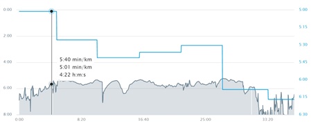
The blue line represents the average pace per kilometer and the black line represents the pace during the race. 
Well, the average pace is well measured (compared to other watches) but the running pace is totally wrong. 
In the example, it tells me that my medium pace in the first kilometer of the race is 5:01, however, in the pace chart the maximum pace tells me that it was 5:40. This is impossible.

Have you guys found this error?

  • In the laps the average pace is correct. But in the plot there is a mistake. Both the y-axis for the pace and average lap pace are off.  For example, for a lap ran at 3:56 min/km, the plot shows it at 4:20 min/km ....

  • In the laps the average pace is correct. But in the plot there is a mistake. Both the y-axis for the pace and average lap pace are off.  For example, for a lap ran at 3:56 min/km, the plot shows it at 4:20 min/km ....