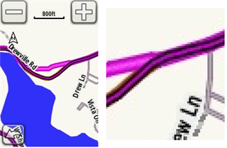
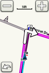
They should use thicker lines and colors that are bright...
The screen on the 1030 washes colors out. To see that, capture a screen shot and display the screen shot on another computer.
The lines (all of them, basically) are too thin on the 1030.
... and different from colors used in the maps for roads. The cyan color in a slightly thicker version now used for the already ridden track would be OK for me but I can't choose that one.
???
Garmin doesn't use magenta or cyan on its maps.
The screen on the 1030, well the colors Garmin chose, are horrible. It's almost impossible to see your route in an urban/suburban area. The course is almost indistinguishable from the roads on the map. If there's a nearby highway, it appears on the map in a color and thickness that makes it indistinguishable from the route forward.

The all-magenta line is the calculated route. The track line is magenta with black borders. It's thinner than the calculated route. The history line is cyan (and it's even thinner than the other two). All this is by design and deliberate (but it won't ever be perfect).Garmin recently added the ability to change the color of the history line.

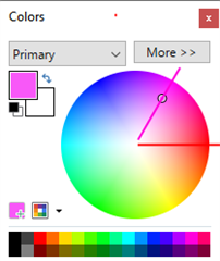
The lightest color used in the calculated route line is on the magenta radius of the color wheel. "Pink" is ambiguous (it's often understood as a lighter hue of red, which is on a different radius).

If you say so. Yet they are not the same color, one is quite a bit darker than the other so calling them both magenta is very comfusing. The practice on this forum has always been to call them magenta, pink and cyan. To my eyes pink suits that computed line very well. But hey.
Yet they are not the same color, one is quite a bit darker than the other so calling them both magenta is very comfusing.
One has black borders. The images in my earlier post are actual screen shots (from an 800).
The practice on this forum has always been to call them magenta, pink and cyan. To my eyes pink suits that computed line very well.
I haven't seen that as a "standard practice". That doesn't mean it's correct either. I get that people see these as "purple" and "pink" but looking at the actual bitmap data shows it's magenta all the way down.
These screenshots look great when viewed on a computer monitor in a dimly lit office. What we see on the device screen in sunlight, through glare and finger smudges, is something else. If it looked remotely like this, I would not have raised the question.
My color perception, like 8% of all men, is red-green deficient. This means we see color but it is much more muted than what others see an some colors are not distinguishable from others. What I see on the 1030 map is that the course ahead, the course already followed and the nearby roads are not distinguishable from each other. The roads appear as either in a light color or a dark one. The light ones appear to be the same color as rivers and each other, all of which are all barely discernible from the gray background. The dark ones are more distinct from the background, though they are the same color as expressways and each other. I cannot see the black outlines that are apparent on your screenshots. Depending on zoom level, the direction arrows are a clue to route location, but they are not always present. The high contrast map selection does not appear to have any effect. Turning the brightness up to 100% helps, but doesn't fix it. While disappointing, I don't really need to see the route so long as I stay on it.
It becomes an issue the moment the 1030 decides I am off course. I have learned the hard way that this is sometimes real and sometimes not. At that point, I need to see the course as well as the direction I'm supposed to go on it. The brightness, contrast and color rendition of the 1030 screen are a given. Developers can still improve the user experience through choice of line color, line width and background color. The high contrast map scheme could even be black and white. I think this is still worth doing. It would allow the 8% of men with deficient red-green color perception to successfully get back on course when lost, as well as helping anyone else who has difficulty reading the map.
Is the 1030 Plus display any better for folks with deficient color perception?