This discussion has been locked.
You can no longer post new replies to this discussion. If you have a question you can start a new discussion

The new web home page is a JOKE

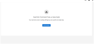
I tried the beta and went back  to the good non beta that shows all the info I want in a manner I want to see it, then when i logged in this morning i was confronted with this

And on pressing the blue button I was confronted with this

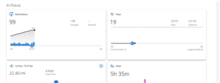
This is of little use to me really as even with in focus turned on  as I have now gives me very little useful info like my dashboards used to

  • Once you get the data types and your charts setup. It brings back all the goodness the garmin app/web just dropped to make it simple and dumb...

  • Seen.  Something to play with over the weekend.

  • Comme énormément de personne, je regrette mon ancien tableau de bord où je pouvais voir dans un petit tableau :

    - ma dernière activité avec la carte et les données principales (et possibilité avec les petites flèches de les faire défiler rapidement)

    - mes 10 dernières activités avec date et distance.

    - le calendrier mensuel.

    - le rapport de distance mensuel des 6 derniers mois (diagramme)

    Je trouve complètement nul de ne plus avoir la possibilité d'afficher ces infos !!!

  • Is the new home page an infiltration of the IT department and sabotage by the competition (Tomtom, Suunto?), or a simple self-inflicted work by Garmin? ;)

    Customizable dashboadrs? What for?
    A lot of stats on home page? Come on ?
    Graphs and text descriptions in one dashoboard? Who cares? Reduce it.
    Let's kill the rest of good staff - maps, records, kick out uncommon disciplines, calendar.
    Is it hard to find friends in search engine? Kill search engine too...
    Good job Garmin !

  • Agreed, this is a sad and pathetic joke. GARMIN SHOULD BE ASHAMED!!!

  • Agreed, this is a sad and pathetic joke. GARMIN SHOULD BE ASHAMED!!!

  • "- my last activity with the map and the main data (and possibility with the small arrows to scroll them quickly)"


    One of my most missed features of the old version.. I could see the route and name with info now it s a bland none descriptive meaningless  box..   You have to click on too remind you what that was...But somehow this is progress!!!

  • Somebody at Garmin is fond of scrolling and swiping and really things it’s so damn convenient. New UI has been made by a team of ignorant people. 

  • I've just had a quick look, and can't work out how to get all my data into it from garmin, any tips appreciated