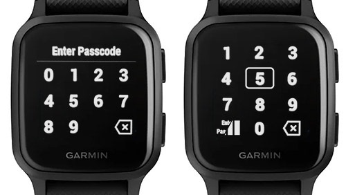
I have an issue with the layout for Garmin Pay pincode. I have thin fingers and small to medium male hands. It is still hard to enter correctly, especially when the cashier is waiting for you. Sometimes it doesn't register, other times it registers a neighbouring digit. I don't have the same problem with the Control Menu icons, so I guess it is a matter of minor spacing adjustment and probably the Control Menu layout works better.
My idea is to have the bottom left say "Enter Pass" or Enter Passcode" in small font that is later replaced by 4 bars - for each digit. The indication will be an outline of the pressed digit for 0.5-1.0 sec.
Here is a quick mockup I did: